Summary
Georgia Tech’s College of Computing (CoC) is ranked number 8 in the nation for computer science. However, the current website and content lack a mobile-friendly layout, and a consistent content hierarchy which makes it increasingly inaccessible to both prospective and current students.
The goal of this project was to consolidate and streamline content in order to improve the navigation of the website, as well as to reduce any friction associated with finding desired content. We are focussed primarily on two user groups, current and prospective students (both undergraduate and graduate level).
This project took us through a path of rigorous research and design which helped us understand the problems of an existing system which is used by thousands of visitors everyday. Towards this we performed a comprehensive survey, a card sorting task, analysis of Google Analytics and a thorough heuristic evaluation. We consolidated the research findings and gleaned insight on the actual wants and needs of our users. Based on these insights, we designed a basic prototype which was tested with actual users. From the findings of this testing, we further improved the prototype into a high fidelity mockup and performed usability testing on it. We presented our research findings and proposed website design to the CoC team.
We consolidated the client requirements along with our study of the the existing system to generate a comprehensive plan for the project.
Research and Design Process
Gathering Data
Start through stakeholder interviews, understand what is expected. Then conduct a heuristic evaluation on the current site, look at user flows and website analytics, to see how users are navigating the website currently. Also explore other university sites, including websites for other colleges within Georgia Tech for a competitive analysis. Through this, formulate a comprehensive research plan which will infrom the design.
User Research
Understand the unique needs of each user group, as well as issues relating to accessibility and mobile usage. Initially we started with a survey, then conducted a a card sorting task to assess our users’ current mental models and understand how users expect the information on the website to be organized. Parallelly, we analysed the data collected by Google Analytics and did a thotough heuristic evaluation of the current system.
Design
The results of the research activities informed our IA and design decisions. We did a preliminary Global Navigation redesign with the main topics in mind (i.e. programs, news, faculty, students, etc). This started with redesigning the information architecture and wireframing.
Iterating over Prototype
Based on the design map and our wireframes, we created a low fidelity prototype of the website. This was tested and then we developed a responsive prototype. After testing our prototype, we developed a high fidelity prototype for our final design.
Evaluation
To evaluate our design and responsive prototype for the website, we conducted expert analysis and A/B testing to assess its ease of use, time on task, and validate the new information architecture. We designed the tasks in these studies around the needs and use cases identified in our user research.

Phase 1 - Initial Research
At this stage, we did a comprehensive study of the existing system along with understanding the client requirements.
Existing System
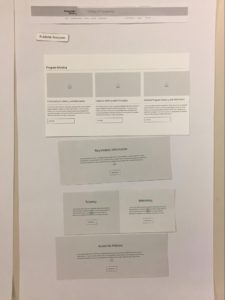
Website Design
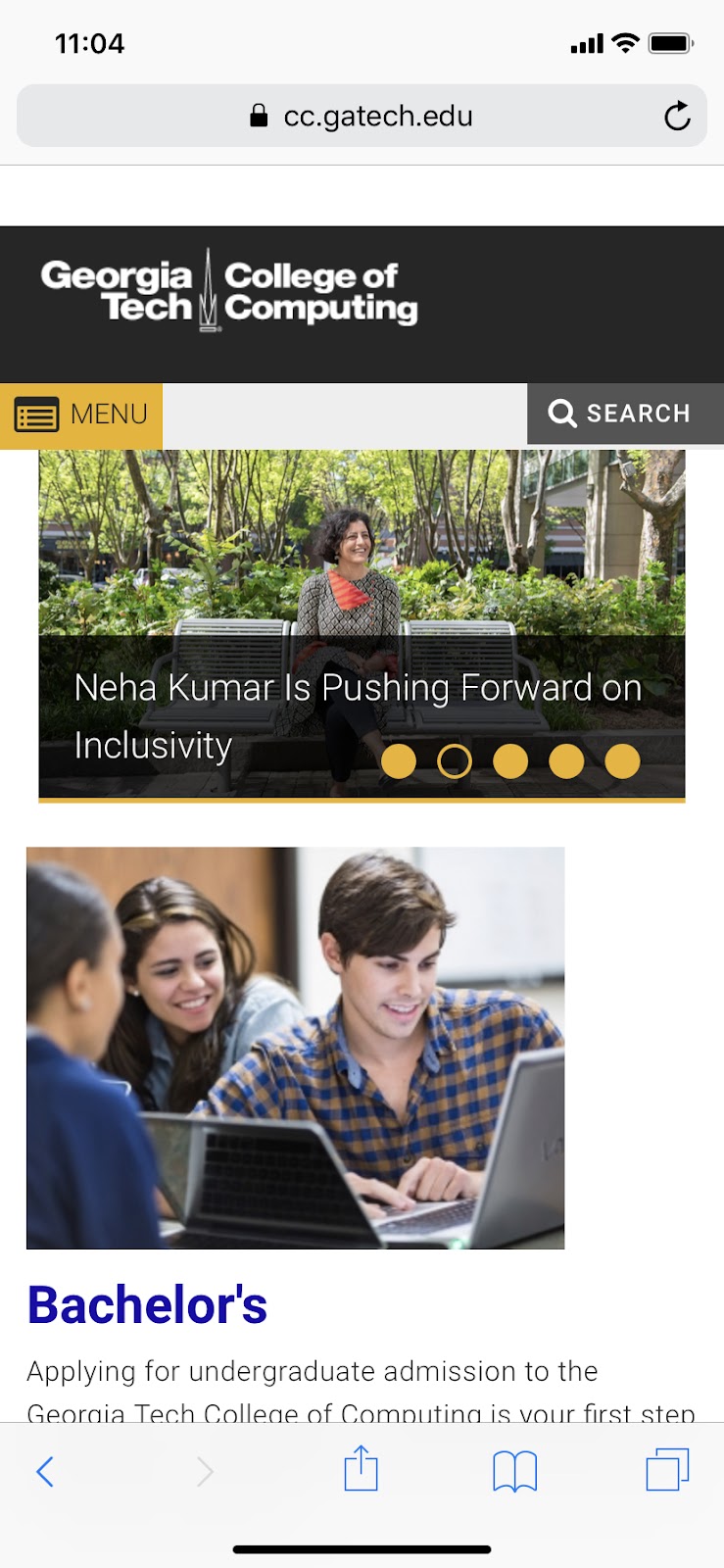
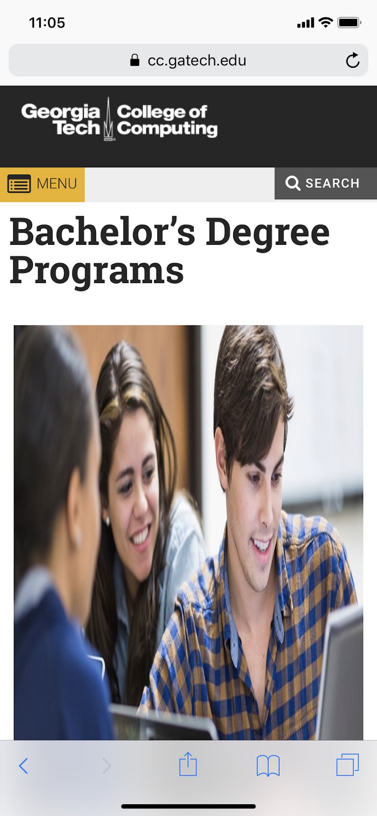
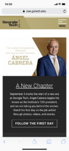
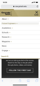
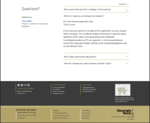
Some screenshots of the current site and first impressions. The user must click through three different pages to find their specific program in some instances. There is no clear path or flow delineated for the user, and images do not scale to smaller device sizes appropriately.
 |
 |
 |
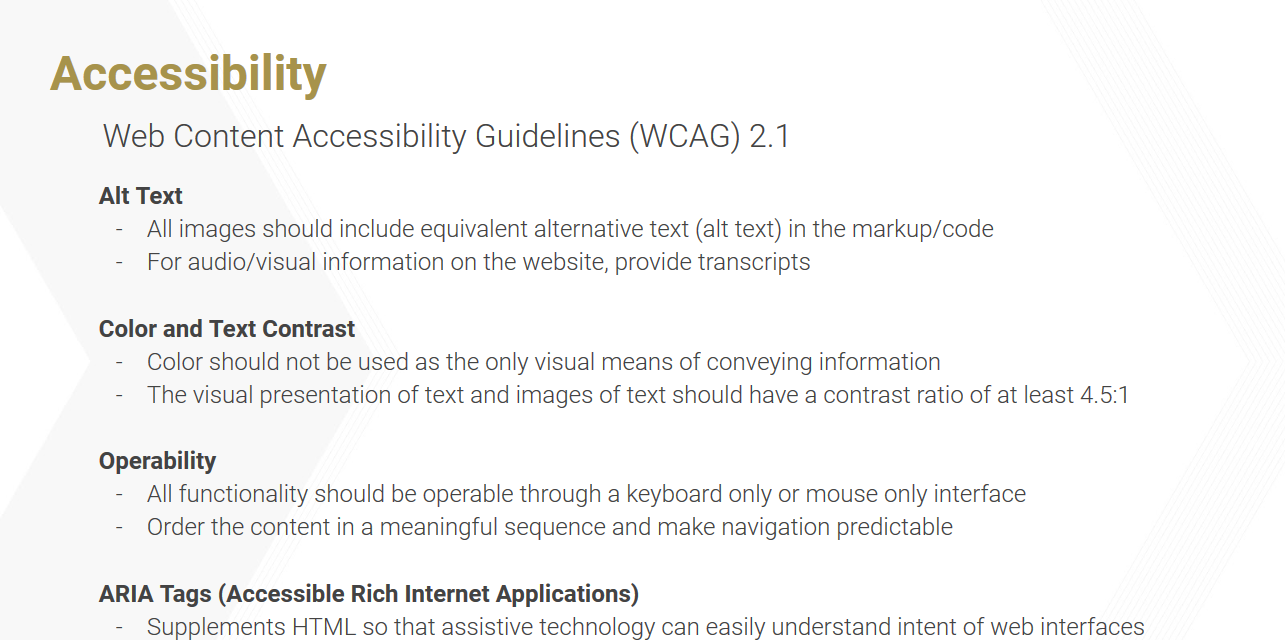
Issues with Accessibility
We ran a free version of a website analysis tool to get a quick glance at how much the website conforms to accessibility standards. We found that 78% of the pages scanned had accessibility problems. Overall the website got an A rating (the worst), which stands for “Pages with level A issues are unusable for some people”.
Comparing Websites
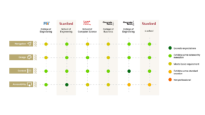
For comparison, we looked at the website of the College of Engineering at Georgia Tech.
 |
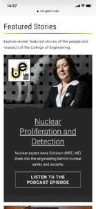 |
 |
The initial impression from this site is that it is more organized, the content is more scannable and easier to navigate overall. The touch targets on smaller device sizes are larger and icons clearly signify functionality - items expand down page to reveal additional content.
Client Requirements
Based on our preliminary research and the meeting with the CoC Communications Team, we uncovered the following requirements:
Reworking in the website’s global navigation structure and information architecture. The client discussed how content continues to be added in pieces onto the website. There is a need for a content strategy and information architecture that can scale to accommodate additional content.
Updating content. There are many broken links and outdated information that is still accessible on the site.
Redesigning within CoC’s branding and style guidelines. The branding and style guide for the website may be found at https://comm.gatech.edu/brand. We are required to redesign the website based on findings and pre-established styles - while leaving the global header and footer as is. However, the research, findings, and design done for the CoC might be applicable to the schools as well.
Accessibility. We must pay special attention to accessibility when going through the redesign. We found that the current website is not compatible with screen readers, nor does it conform to AAA or meet WCAG 2.1’s success criteria.
SEO Optimization. We may (ideally) take into consideration the website’s SEO rankings and redesign the website with SEO in mind. This includes recommendations for developing the new website with a push for SEO optimization.
Phase 2 - Understanding User Needs and Design Implications
In this part of the project we focused on the data collection and how that shaped our design implications. Our initial research gave insights on the research methods we would use to gain an in-depth understanding of the wants and needs of our user group. The stakeholder interviews aligned our process with what was expected. We started our research with a survey sent out across all students of the college of computing. While the survey was out, we started analysing the data collected from Google Analytics. At this point we also began a heuristic evaluation of the current system. We analysed the results of the survey and this helped us define a card sort task. Finally we combined all the data gathered from these research activities and formed a holistic understanding of the wants and needs of our users. These insights were then converted into design implications.
As we collected more data and identified key issues of the existing system, we expanded the problem space to also include a way to facilitate site visitors to find the content they are looking for and thus improve the overall experience for all site users, including people who use assistive technologies to access the website.
Stakeholder Interviews
The stakeholders we interviewed had varying responsibilities within and outside the College of Computing, so our interviews allowed us to hear from other parts of the administration and university.
Our goals for these interviews were as follows:
- Highlight issues with the CoC website that stakeholders within the CoC struggle with on a regular basis.
- Identify problematic or missing site content that stakeholders would like to see addressed
- Assign a priority to the issues identified by the CoC team
- Gain a basic understanding of accessibility tools and how they can used in website design
Method Details
We connected to different stakeholders through the CoC team. For each stakeholder, we met for about an hour and had some topics we had prepared beforehand. But for the majority of our time with them, our interactions were conversational and we wanted to hear what the stakeholders had personally experienced, their needs, and the needs of the students they interacted with.
Analysis
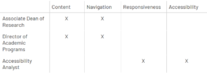
To analyze our interview data, we started by transcribing our notes onto cards, separating the notes based on the different themes addressed. We thought this would help us find commonalities between the three interviews, but because the three stakeholders had such varying interests and job roles, it was difficult to identify patterns across the three data sets. So instead, we applied the data we found to our larger affinity map, which had themes from the other research activities we conducted. Through our affinity map, we were able to categorize our notes according under the larger themes of accessibility, responsiveness, content, and navigation.
Heuristic Evaluation
Conducting a competitive analysis and heuristic evaluation served as a starting point for our user research and provided a good benchmark for both competitors and for the current state of the website.
Method Details
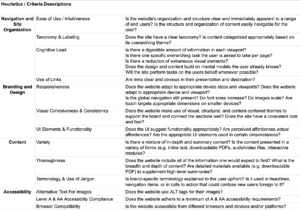
We extrapolated evaluative criteria from a larger set of widely used common principles and best practices, or heuristics, and applied them to a competitive analysis as well as a heuristic evaluation in order to diagnose the College of Computing website’s current state. The heuristics we used in both our competitive analyses and CoC website audit were picked from the Information Architecture Heuristics by Abby Covert (Abby IA), Nielsen’s Usability Heuristics, and W3C Web Content Accessibility Guidelines.
We grouped our criteria into four main categories based on their overarching themes :
- Navigation and Site Organization
- Design & Branding
- Content
- Accessibility
Analysis
The heuristic evaluation uncovered multiple aspects of the current design and how it could be improved.
Survey
For our survey, we wanted to identify the areas of interest and usability challenges that students in CoC face when they use the website. Specifically, we were curious about the following themes:
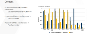
- Content: What content are students most interested in? Why do students come to the CoC website?
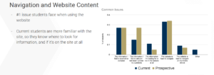
- Navigation: How discoverable is content on the website? How are students accessing the content they need? What challenges do they face in finding the information they want?
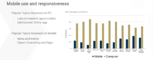
- Responsiveness: What information do students access while visiting the site on their mobile devices?
- Accessibility: What assistive technologies or tools are users employing when using the CoC website? What are the unique issues they face when interacting with the website through an accessibility tool?
Method Details
We designed a 24 question survey in Qualtrics, which was divided into 4 blocks:
- Introduction and demographics: to identify participants’ degree program and tenure at Georgia Tech for that program. Because the CoC is interested in the perspective of prospective students, we wanted to separate and use the first year students (for all degree programs) as a proxy, who had completed the application process most recently.
- Website Experience: to ask various questions on the usability of the website, identify areas of interest, devices students use to access parts of the website, and challenges they face. First year students saw slightly different versions of these questions (e.g. “When you were applying to Georgia Tech,...”).
- Accessibility: to identify students who use assistive technology to navigate the website, and gather data on that experience.
- Volunteering for Further Research: a final block that linked to a separate survey where students could provide their contact information if they wanted to volunteer for our future research activities. The two surveys were separated to keep the responses of this survey completely anonymous.
Analysis
In order to do a fair comparison between the different student populations, we normalized each data category to the number of responses we got from that demographic (per degree level: undergraduate, masters, or PhD; or per current/prospective).
Card Sorting
With our hybrid card sorting task, we wanted to identify patterns in how visitors expect to see the website content to be organized. We chose to do a card sorting task for this project as a precursor for our next step: redoing the website’s information architecture. Our goals for the card sorting task can be summarized as follows:
- Identify large categories of content that students expect to see on the CoC website
- Identify subcategories to populate each of the larger categories identified above
- Pinpoint extraneous or ambiguous content
- Surface missing topics or content that students want to easily find on the website
Method Details
Card sorting tasks are often employed when (re)designing the information architecture of a website. We chose to do a closed card sort because there are existing categories on the website’s navigation bar that we felt would simply re-emerge if we had done a fully open card sort. In our task, we allowed participants to write in any elements or categories that they would want to see or remove any that felt irrelevant. With the exception of one or two, the categories remained largely the same, confirming our idea that providing some pre-existing categories would not compromise the validity of the task.
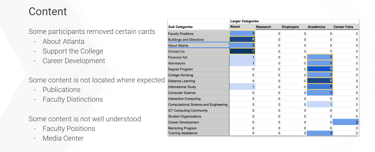
Analysis
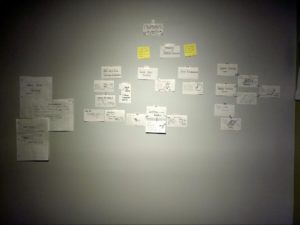
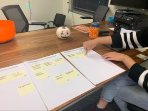
For each participant, we took a photo of their card sort to use in our analysis. We will be looked at how frequently each card showed up in a specific category across participants, and whether or not some of the larger categories needed to be changed, removed, or added. We also gathered qualitative data from participants and derived insights by looking at trends from the card sort along with the qualitative data.


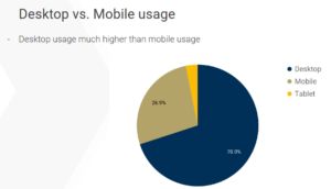
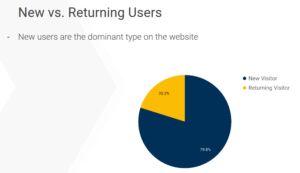
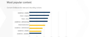
Google Analytics
The College of Computing website has upwards of 50,000 users every month. With Google Analytics integrated into the website, it is possible to access information on how these users click through the website. The site’s analytics provided insight on usage trends and user behaviors.
Methodology
We decided to narrow down the categories to study based on an initial overview of all fields available and further based on the survey results that we had. This allowed us to focus only on what was relevant. We all collectively surveyed the analytics and parsed through the Audience, Behavior, and Acquisition sections in order to determine which metrics we wished to explore further, and which would be useful for us to supplement the other research methods we were employing.
 |
 |
Phase 3 - Design Ideas and Feedback
During this phase, we focused first on breadth as we redesigned the global navigation, or main menu of the website. From there, we took a deep dive into a specific section of the site, currently labeled “Academics”. It was made apparent from the CoC communications team, our survey results, website analytics, and card sorting results, that the content in this section was not easy to find, and navigating to content has been arduous for both types of students.
Our Approach to UI Design
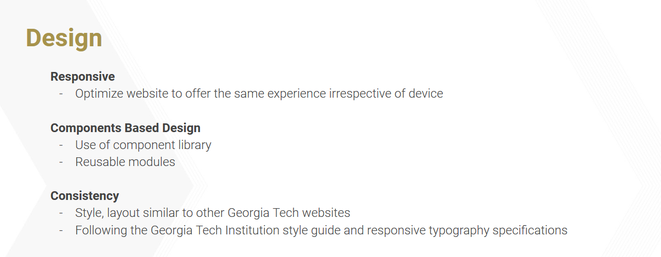
Taking from Brad Frost’s Atomic Design, we utilized a component-based or modular-design approach to the College of Computing website redesign. This approach enabled us to devise a system of user interface groupings - or components - contextually linked to types of content that cater to our primary user groups: current and prospective students. Each page on the website will be constructed by stacking these components one after the other, creating page layouts of concise and consistently designed content, cross-site.


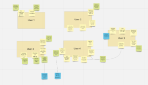
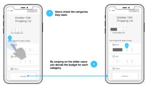
Global Navigation
The card sorting task, shed light on how the global navigation could be reorganized according to students’ information needs and existing mental models on higher education websites. Using these insights, we created a high-level diagram of our redesigned global navigation.
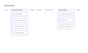
Within the new ‘Prospective Students and Current Students tabs, we focused on four pages and two navigational pathways for our feedback sessions.

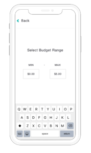
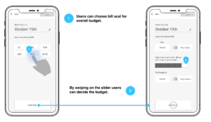
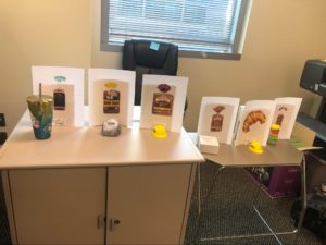
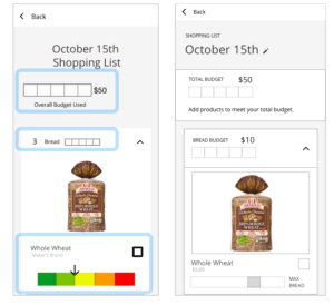
Prototype Designs
For our initial feedback session we worked to develop an low-fidelity prototype consisting of four canvases and paper cut outs of UI Components. These components were first tested through pilot testing. After the pilot test, we amended the prototype design in order to better test what we set out to measure. By removing UI from the prototype, and replacing it with blank cards, we were able to better test a participant’s mental models surrounding content placement, and how they organized the content in a hierarchy from the top of the canvas or page to the bottom.
 |
 |
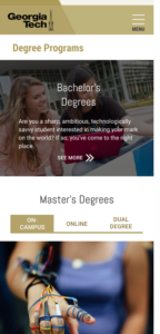
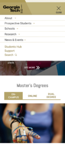
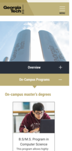
Wireframe of the ‘Degree Programs’ page

Feedback Sessions
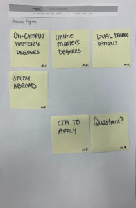
In our first study, we wanted to understand how to organize content within pages. We designed our own research method for this activity, catering to our specific scenario, derived from other research activities. In our research method study participants would organize distinct in-page components based on their understanding of the content, how they felt it should be organized, and where it belongs on a given page. This is similar to a card sort but instead of sorting a higher level organization of content - like in a global navigation - participants are asked to organize content components in-page.
The participants were presented with a blank canvas for a single page and the individual components associated with that page. The participants were asked to arrange the individual components on the canvas in a way that best organizes the information on the page. While they were completing this task, the researchers asked the participants to think out loud and reflect on why they were organizing the page in a certain way.
 |
 |
Summary of Findings
- Users want to see Calls to Action (CTAs) and most relevant information at the top of the page. Participants commented that they would like to see links immediately if a page had an obvious CTA.
- Platforms influenced the desired content hierarchy. Participants commented on how, on mobile, they would prioritize CTAs even further by making them the first item on a page. On the desktop format, participants placed the CTAs close to the top of the page, but often to the right side.
- Overview pages should include concise but informative descriptions about broader topics. These pages link to more detailed, content heavy pages, so overview pages themselves tend to have more visual elements like images and banners.
- Content titles need to be validated. One of our tasks was focused on finding the ‘Program Advising’ page, but our participants were confused as to what that meant.
- Because the website is rich in content, the user might get lost in the multiple layers of the information architecture. The website contains a lot of information about a large variety of topics. Users require wayfinding mechanisms on each page they visit to understand where they are and how they got there.
- A Components-Based Design approach can be leveraged to apply both a consistent design system as well as accessibility principles across the website. By first designing page components, we can scope our work and templatize the website redesign process because we will have the building blocks for each page.
- Prefer simple design. Participants commented that the minimalistic elements were helping to declutter the pages and helping them focus on what they were looking for.
Prototype Improvements
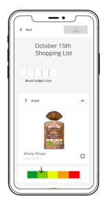
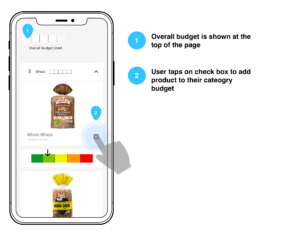
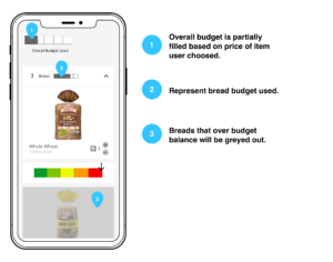
Based on our feedback session, we modified our initial prototype. From the ‘Degree Programs page, users can click on the ‘Masters Degrees’ component to reach the ‘Masters Degrees’ page. Similarly, from the ‘Academic Resources’, the user can click on ‘Program Advising’ to reach that page. This paved the way for our final design.

Phase 4 - Final Design, Evaluation and Validation
Final Prototype
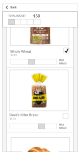
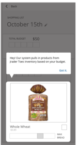
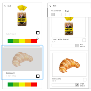
Our final prototypes consisted of hi-fidelity designs linked together in InVision and Adobe XD, and enabled users to interact with the redesigned College of Computing website on both desktop and mobile breakpoints. Our prototypes were exportable, and had public URLs to share and to test with.
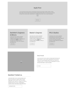
Before we designed and prototyped the website’s pages we created a component library. The library, or component documentation, consisted of a medium-fidelity images of each component in desktop and mobile breakpoints and the component’s feature and function specifications - such as the UI elements used, the grid system used, and aspect ratios for all images - to hand to the CoC Communications team after our final presentation.

We then designed hi-fidelity website pages for the prototype using our components and Georgia Tech’s institution-wide style guide.
 |
 |
 |
Evaluation
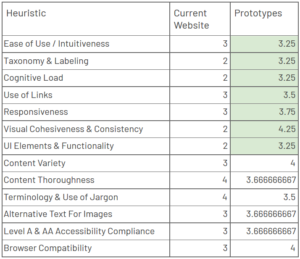
Expert Based Method: Heuristic Evaluation
For this research, we asked four experts to evaluate our prototypes. The four experts were selected based on their expertise and availability. Two of the experts were students in the MS-HCI program; one had a background in design and writing, while the other had a background in psychology and prototyping. The other two experts were professors in the MS-HCI program, and brought overall expertise and knowledge of design, especially in the accessibility and web development space.
The heuristics we used for this evaluation were the same as the ones we used in the earlier heuristic evaluation of the current website. The heuristics were selected from several existing sets that are commonly used in industry. These sets included:
- Abby IA
- Nielsen’s Usability Heuristics
- Shneiderman’s Eight Golden Rules
- W3C Web Content Accessibility Guidelines
Each expert provided a score for each of the heuristics on the given list. Scores were given on a scale of 1 to 5. We then took an average of the scores across the 4 experts for each heuristic.
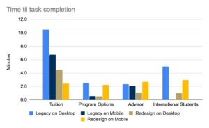
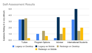
User Based Method: A/B Testing
We user usertesting.com for this purpose. Users on UserTesting.com were shown a link to either the mobile or desktop prototype. They were provided a scenario and given tasks to complete in the prototype.
Scenario: “You are a student at a higher education institution and are checking the homepage of your college.”
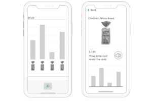
Task 1: “You are thinking of doing an on-campus Masters of Science in Computer Science (MSCS) and want to know the cost associated with it. Find this information on the website.”
Task 2: “You are thinking of doing an on-campus Masters of Science in Computer Science (MSCS) with a Thesis option, find out the requirements that this option entails.”
Task 3: “You are a Masters student in Computer Science looking for program advising. Find out who your advisor is.”
Task 4: “You are an international student looking to study at Georgia Tech and would like to find information for international students. Navigate to the page where you would expect to find this information.”
After each task, participants were asked if they completed the task successfully. The answers allowed were: “yes” or a variety of no answers with reasoning for why the task wasn’t accomplished. Participants were also asked to rate the difficulty of the task with a Likert Scale going from Very Easy to Very Difficult.
Additional metrics we collected are time-to-task-completion as well as qualitative data on where users are looking for information.
 |
 |
Recommendations For The CoC Communications Team
As a final deliverable, we presented our consolidated research and redesign to the CoC communications team along with a set of recommendations. These came from the culmination of all the design and research activities we had performed over the course of this project.