Introduction
Understanding The Problem
Dyscalculia has a prevalence of 3 – 6% but it is poorly understood. Individuals with dyscalculia often show difficulties in driving or gauging speed, budgeting, time management and completing simple math. Dyscalculia often occurs together with dyslexia, which will be important to keep in consideration for the design phase of this project. As with dyslexia, it is not clear whether these children have two independent conditions, or if their difficulties in mathematics are caused by their difficulty in maintaining sustained attention.
No agreed definition of dyscalculia makes it hard to diagnose individuals. The complexity in defining people with dyscalculia creates substantial variation in methods and results throughout studies. All the definitions around dyscalculia have three similar aspects:
1) showing difficulties in tackling math
2) having difficulties in certain areas instead of all academic realms
3) it is assumed that is caused by brain dysfunction in some way
Dyscalculia is significantly different from the other conditions in the sense that it does not impair mental ability, only understanding of mathematical concepts in varying orders is affected. Following this, we choose to design within the context of processing, interpreting, and manipulating numerical data as it relates to financial management and budgeting.
Scenario of The Problem
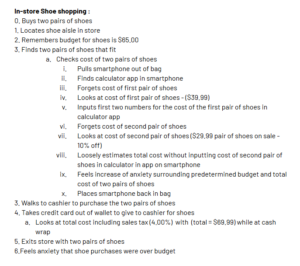
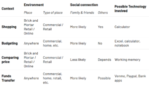
Consider a scenario where a neurotypical individual is shopping at a superstore. Even though the shopping styles may be different, there are a few key elements in the customer-store interface that are shared across people. First of these is knowing what to buy; this could be a shopping list or a mental list of items that are needed. After entering the store, the next step is to navigate to the location/aisle of where the required item is stacked. Normally in a supermarket, there is a huge variety of items of the same type. These could differ by brand, quantity (weight/volume), cost, specialty and so forth. In order to reach an informed decision, an individual has to compare these quantities as well as the qualities (specialty) of the product. This situation involves using several counting and comparison capabilities, all of which are problematic to individuals with dyscalculia.
Task Analysis
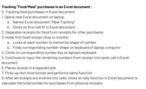
We explored two different hierarchical task analyses for individuals with dyscalculia to calculate the items they wish to purchase against the amount budgeted for those items,
Analysis of Existing Systems
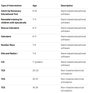
Most of the existing systems that address dyscalculia target mathematical skills and number sense in early development stages (children between 6-11 years old). The majority of these systems are software based. In previous research, adaptive game software-based solutions have been successful in the remediation of dyslexia. Software for dyscalculia is based on understanding that dyscalculia comes from a deficit in numbers sense or in connection between number sense and the symbols for numbers.
SocioTechnical Systems and Context
Individuals with dyscalculia often have “math anxiety”, or feelings of tension and fear associated with activities involving mathematical operations, equations, and the like. This is the root of our problem space and what we would like to study and design for in context. Our discovery evidenced a lack in dyscalculic-friendly tools and systems that target adult individuals with the disability. Through surveying personal blog posts and online support communities, we found that many dyscalculics rely on their friends and families to help navigate these financial situations currently.
We were wary to draw conclusions this early in our design process. With that being said, findings online and in our preliminary research were encouraging and supported continued research of dyscalculic individuals activities relating to budgeting and financial management. We wished to further explore the relationship between dyscalculia and difficulties interpreting numerical data - as well as design solutions to mitigate these difficulties.
Design Alternatives
At this stage, we narrowed our focus on the shopping experience in a brick-and-mortar store. We choose to target the process of browsing through different products and comparing their prices. This is inherently a mathematical operation and, due to the way prices are depicted, it is also a common challenge voiced by individuals with dyscalculia. Our design aimed to alleviate dyscalculics’ pain points by designing a solution that compares products to: a fixed quantity (i.e. common denominations of currency such as $5, $10, and $20) and similar products. In our designs, we have leveraged past intervention techniques in order to create multimodal solutions that facilitate numeric comparisons in alternative forms.
There are two main comparisons that occur in this process. Based on a fixed currency amount, or in-between goods.
- Comparing numbers to a fixed quantity. This involves any scenario where the individual feels that $7 is a high number, but they are not quite sure how high/or close to $10 (known paper bill) it is.
- Comparing numbers relative to one another. This involves a scenario where the user wants to compare two items between each other and needs to “experience” a clear difference in monetary cost between them (i.e. $8 > $7)
Scenario
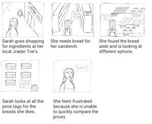
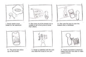
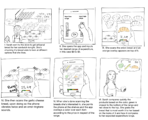
Our user decides to make a sandwich and goes shopping for artisanal bread at her local Jrader Toe’s. At the store, she finds several options in the bread aisle that meet her qualitative specifications (puffy, looks good, everything you’d want for sandwich bread). Then, she proceeds to look at the price tags to do a quantitative comparison but she cannot make a decision because she struggles to efficiently comprehend and compare the different prices.
Design Process
We interviewed experts on dyscalculia and individuals who have the disorder through internet forums, social media groups, and over the phone. From these methods, we gleaned insights that informed an ideation session where we identified categories of challenges dyscalculics experienced. Then each group member worked to identify specific problems within the categories. Finally, we discussed and voted to decide which problem space we want to solve for in this project. This helped us identify flaws, opportunities, and key design implications in various avenues, thus shaping our final design.
Informed Brainstorming
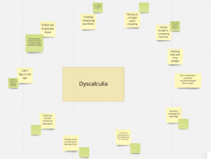
To devise possible design implications, we brainstormed through open discussion backed by our research. We created a board for our brainstorming using Miro, and grouped pain points in context per user (yellow post-its). After this, we then started to think through possible design implications (green post-its) that we believed would aid or amend the problem areas in different situations. This provided us with a holistic view of the problems and possible problem spaces.
We found patterns in users’ pain points as well as in their efforts to mitigate them. Users generally avoided situations involving mental calculations, and preferred to write things down if they needed to do math throughout their day to day activities. They seemed to have difficulty with short term memory involving numerical values, such as prices, times, and dates. Time as a concept seemed to be a pain point, we found a large number of our users had difficulty comprehending or comparing the time to do everyday things, as well as perceiving time as a general measurement.
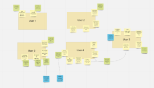
Interviews
We spoke with five individuals with dyscalculia directly, which gave us first-hand insight into the day-to-day challenges they face. Another one of our interviewees was an expert who had over 100 interviews with individuals with dyscalculia. Her expertise helped us narrow the scope of our project and focus on a more general problem space.
Our interviewee highlighted three overarching themes with most people she did research on. First they have a hard time ordering things, not just numbers but the alphabet, keeping a sequence and estimating the distance between elements. Second, they are slow in reading a number, as if they have never seen a number before, they never become fast. Third, they always count, even if it is a basic operation like 2 + 3. Some people have orientation problems or working memory difficulties but not all do.
We started to sketch the potential design ideas, and grouped them by the required technology stack. We dived into each solution, walking other members of the group through attempting to solve pain points in the scenario with the solution on hand. This exercise helped us identify opportunities in various avenues that ultimately shaped our three alternative designs.
First Design Alternative
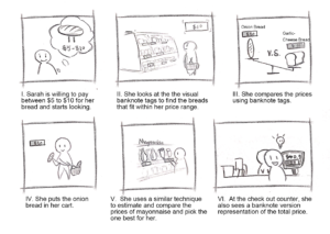
Research showed that individuals with dyscalculia find it hard to recognize price tags’ values commonly used in supermarkets, this makes it equally difficult to make comparisons or estimate a price. One design-relevant piece of information we found during an interview was that dyscalculic individuals find it much easier to understand “whole quantities” such as 10, 20, and 30. We built upon this insight in our first solution and devised a way to compare the prices of items to the next common denomination of a bank note. Thus providing a visual representation of the cost along with the ability to estimate the price relative to a familiar and relevant bank note.
Price tags at stores would have a pictographic bank note of the next largest denomination attached. For example, if the price of a product is $3, a $5 bill will be visible next to the price tag. If the cost of a product is $7, the bill presented next to the tag will be $10.

Another prototype of the same idea, with subtle changes to make the numeric text more accessible.

The three primary components in this design are 1) the physical tag which shows the information alongside a traditional product tag, 2) the banknote design indicating the next banknote denomination, and 3) the progressive highlight of the banknote representing the price of the product as compared to the value of the banknote. We choose banknotes as a common reference as through our research we found that even dyscalculic individuals are familiar with them, mainly because of the frequency of use in their daily lives. Even though most transactions are card based these days, physical currency still remains as a familiar presentation of money.
The choice for making this a physical tag comes from ease of use. We do not want to limit any user to use a particular device or app for this solution. Even though there is an added overhead on the side of the supermarket, it is a relatively easy change to integrate; supermarkets print out tags for their products already. This design was an attempt to make the solution truly inclusive, and not dependent on the user’s access to technology.
Second Design Alternative
Out of many factors that determine shopping decisions, we identified two major parameters:
- Product Affinity: “is the product suitable?” or “how much does the user want the product?”
- Product Price: “what is its price?” or “is the user willing to pay this price?”
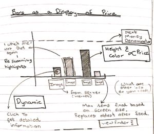
Both of these are largely dependent on comparison. Information about how the product price compares to other similar products is essential in making an informed decision. Our second design alternative tackles the problem space from this direction. It allows for quick and easy comparisons across items of the users choice. This is done through a visual, non-numeric representation: a bar graph.
 |
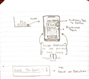 |
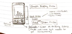
The core purpose of this design alternative is to enable users to compare prices between products relative to each other and to absolute denominations. The user scans the barcode from the product price tag and loads the price into the app. The barcode pulls in all relevant product information, including the product’s image, from the company’s online server. This allows for easy visual comparison and identification.
In the main UI of the app, there is a bar graph, where each bar represents the cost of each item that the user has scanned. As the user scans more items, the graph axis readjusts to display the next highest banknote denomination (if $7 is the cost of the most expensive item scanned, the y-axis of the bar graph goes up to $10). Every bar on the y axis also scales accordingly.
Each of the bars in the graph will have a picture of the item scanned right below for quick recollection. A maximum of 4 items will be compared simultaneously on the UI to account for cognitive load. Every newly scanned item after the 4th item replaces the earliest scanned item (first in first out).
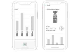
Upon tapping on the image/bar of an item, a secondary screen appears with a magnified picture of the item and both the numerical and non-numerical description of the cost. There will be the option for audio output if the user clicks on the speaker icon and the user can hear the price spoken to them. Furthermore, the bar graphs corresponding to each item scanned will be highlighted in a high contrast color on the UI. This increases scannability across the various items. The Open Dyslexic font is used throughout the app for all the text, further enabling the user to scan the information on their device.
For individuals with dyscalculia, comparing shapes is always easier than comparing quantities. In fact, learning through shapes was a predominant technique for teaching math to children with dyscalculia. This app idea enables users to compare available products through the display of prices as proportional shapes.
Third Design Alternative
When shopping, a user usually has an estimate of how much they are willing to pay for a particular product. This is often used as a first filter for buying cheap, normal, or premium products. This design alternative gives the user with the ability to have such quick overviews. Using recent developments in spatial tracking, depth mapping and augmented reality, it uses multiple techniques of multimodal sensory stimulation to help the user get “a glimpse” of available products without having to spend too much time. For this solution, a user would be required to have a phone capable of supporting augmented reality apps. Further, their dyscalculic symptoms should not be so severe that they cannot decide the price range they are interested in.
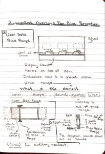
The user inputs a target price range and scans the items on store shelves through a mobile AR app. As the user scans the shelf, the app produces an AR overlay, vibration pattern, and sound to indicate which items are within the given price range. This multimodal feedback occurs in a redundant manner. It is designed such that users use vibration and sound to make the first decision on whether the chosen product warrants their further attention (whether it is in the price range).
If the user scans single items, he or she receives auditory and haptic feedback for each item. A bell chime is played for products within the price range, a high pitched error tone for prices higher than price range and a low pitched error tone for prices which are lower. Users also receive a haptic feedback consisting for a double vibration along with the error tone for every product that is out of the price range. The app is designed in a manner such that users rely on the tone and haptic feedback to get a “first glance” of the price without even needing to look at the screen. If they want, they can look further into the price comparison.
 |
 |
If the user scans single items, he or she receives auditory and haptic feedback for each item. A bell chime is played for products within the price range, a high pitched error tone for prices higher than price range and a low pitched error tone for prices which are lower. Users also receive a haptic feedback consisting for a double vibration along with the error tone for every product that is out of the price range. The app is designed in a manner such that users rely on the tone and haptic feedback to get a “first glance” of the price without even needing to look at the screen. If they want, they can look further into the price comparison.
This design facilitates the ability to look at product prices ‘at a glance’. The overview feature allows users to quickly identify products within their price range. The design first provides the user with non-visual cues on whether a product fits in their price range. Only then do they need to look at their screens to see where a product’s price falls in their budget. The color coded mechanism chosen is intuitive, widely used, and conveys information very quickly.
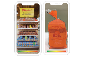
An important ability of augmented reality is that it can map virtual elements to objects in the surrounding physical space. The overlays, once placed over an object, stay there irrespective of how the user moves around. This also allows users to stand back, review, and return to all the products they have chosen.
The use of augmented reality also opens up the opportunity to display any other information the user might require over the product. A color overlay was chosen for this design because it succinctly conveys all the necessary information as quickly as possible.
System Prototype
Description of the System Prototype
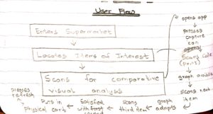
Before entering the store
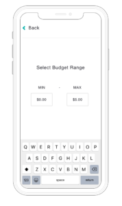
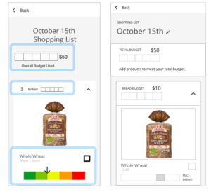
This solution is meant to be utilized in the time period where the user is setting a budget and deciding upon a shopping list for their next grocery run. During this phase, the user has a conceptual idea of how much they would like to spend and they input this in the app. The idea is to do all the planning in advance, so that the user doesn’t need to do addition or subtraction in the store, where they may need to also concentrate on their shopping lists and finding items. Once the overall budget is set, individual budgets for each item on their shopping lists are set using a graphical range to represent product price in relation of the overall budget.
In-Store
Our tool is meant to be a mobile app, but has the potential to be integrated with a smart watch with reduced functionality. In the store, the mobile app will show possible products they can buy in each category they specify on a shopping list that fit into their budget. By including the app on their smartwatch, the users will be able to check out their shopping list “on-the-go”, or in transit during their shopping experience.This is ideal in case the user forgets an item, and must check the list to see what items to search for next. If the app is on a smartwatch, even with reduced functionality, the user may (1) see the list of items they had previously created prior to shopping, and (2) in utilizing the store’s inventory online, the watch may display product visuals for the user to compare color and branded packaging with the products they are viewing on the shelves.
Back-end
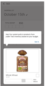
The database of the application is connected to the current store’s website/application using an API to request product information (i.e. product names, prices, descriptions). By doing so, users can see the updated product price on the application in real-time. When the user sets the budget for the individual categories, the app calculates the actual dollar amount and cross checks across all items that fit in the selected budget.
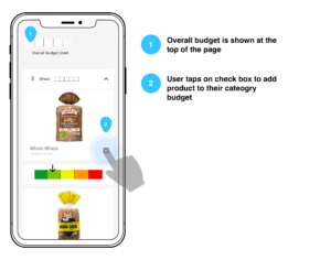
By having a visual representation of how much the price of the item is in respect to the category budget we can a) remove numbers to represent its price and b) allow users to visually compare multiple items between each other and see if they fit within their budget. The app also displays an empty bar (representing the overall budget) on the top of the page, so they can view an estimation of how much of the budget remains. If the user wants to purchase different items within the same category, they can click on the check mark and if allowed (depending on item cost and budget) they can increase the quantity. When the user checks one of the items, the budget bar fills up partially (or completely if item takes all budget) and the individual price bars scale to reflect the cost of the item in respect of how much money is left.
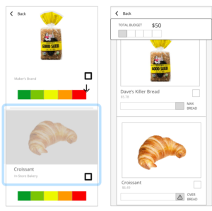
Upon opening the app the user is presented with a main screen where they can set the budget for their next grocery trip. In order to set their budget they operate an interface which includes elements of sliding to choose the budget. The farther the scale extends to the right, the higher the budget rises, likewise as it extends to the left, the budget decreases. This is beneficial for individuals with dyscalculia as it specifically does not involve any numeric input. In this two-step process, the first step is meant to help users identify the largest bill they would need for their shopping trip. This is important because many adults with dyscalculia are familiar with conventional currency amounts, and are able to more easily choose a value out of these options. The second step allows users to fine-tune their budget, relative to a value they understand well and predetermined.
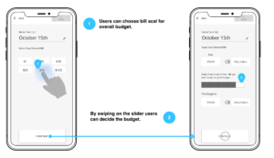
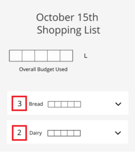
In this scenario, the user selects $40 as the final budget for the next grocery trip. Once this is done, they are presented with different categories (e.g. bread, diary and meat.). They then set individual budgets for those categories as well. A design intervention we have applied here is scaling the budget for individual categories as a factor of the main overall budget. In this manner, the user has a visual non-numeric representation of how their shopping choices may affect the total budget they have allocated. Further, they can also set and visually verify how these shopping choices affect their individual allocated category goals.
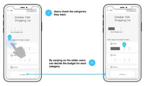
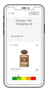
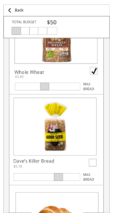
Once the budget for the individual categories is set, on the main screen there is a list of the different categories set by the user. Upon clicking on them, a drop-down appears with images of the different items the store has available which fit in the set budget. On the bottom, each of these items will have on a horizontal bar color coded to symbolize the quantity of the budget that this item will take. In this manner, we simplify the decision making process of the user by presenting them with only the products which fit their wants and needs along with their budget restrictions.
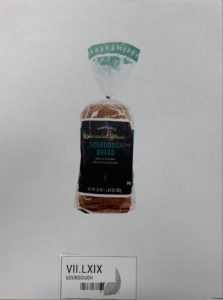
Once at the store, the user will be able to select a category (let’s say bread) and then go through the different options that fit in the budget, i.e. whole wheat, grain, sourdough, etc. The user can look at the bread shelves and locate the ones listed on the app. Upon a survey for texture, visual appearance, etc. the user can select the one they like the most from all within-budget options. Going through the overall store the user will be able to gauge what items fit on the budget, which ones don’t and select accordingly. The intention of the app is not to restrict users to buy only the items that are within their budget, but rather to provide assistance in making an informed choice.
 |
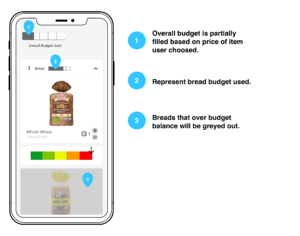 |
At any point during the process, the user can tap on the budget bar and see how much of the bread budget they have already used.
Evaluation
We simulated the effects of dyscalculia by obfuscating all numeric events in the traditional places where numbers are usually located in the shopping process. This was done using a script that is difficult to read. Through pilot testing we determined that this technique allows the participant to understand the number but the numeral recognition time is significantly increased as compared to a normal scenario. In this manner we simulated a major symptom of dyscalculia.
Think-alouds
We presented our participants with an interactive prototype app and gave them high-level tasks that took them through a user workflow. For each task, we asked the participants to talk through what they were thinking when they interacted with the prototype’s UI. Through the think-alouds, we aimed to gather qualitative feedback on elements within the UI such as colors, buttons, CTAs, and interaction paradigms.
Testing The Immersive Shopping Experience
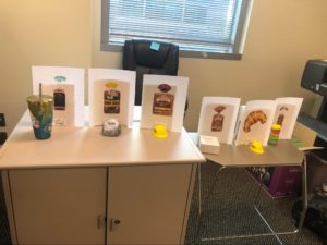
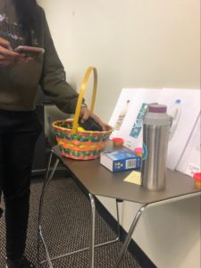
To simulate an in-store experience, we set up an open area with tables (“shelves”) and items on the desks. Behind each item was an image of what that item represented (e.g. a specific brand of bread or type of milk), along with a price tag written in roman numerals. At the beginning of their “shopping trip”, participants were given a small basket to place items into. This was to test the interaction with a mobile app while holding and picking up other objects. The whole in-store part of the experience didn’t take more than 6 minutes per participant.
 |
 |
For those who had completed the think-aloud previously, they were able to use the app to select specific items before shopping. The items listed in our prototype were a subset of the items in our shopping experience. The tasks the participants completed in this evaluation phase mirrored the tasks in the think-aloud:
- Pick as many breads as they would like, staying within a $10 budget and place items in the shopping basket
- Pick as many milks as they would like, staying within a $5 budget and place items in the shopping basket
- Return the basket to the experimenter and complete the NASA TLX form.
Evaluation Results
NASA TLX Data
To evaluate the shopping experience with and without the app we had them fill out a NASA TLX form as described in D3. The idea is to measure task load on different fronts (i.e. mental, physical, temporal, etc) to determine whether the app is an actual improvement over reading complicated price tags. From this we learned that people who used the app experienced a higher mental demand and perceived their performance was worse. However, on average they thought the task was less physically and temporal demanding, and they rated lower levels of effort and frustration. Among all these categories, the mental demand was by far the one where users agreed on the difference on app vs no app with 5-point difference in rating. Followed by physical demand with ~4 point difference.
Qualitative Findings
We consolidated our research findings and ranked them on the number of occurrences. This is the number of times users brought up this topic or issue.
Participants found the bar and the representing graphs confusing. In three instances, participants found that the price displays through the bars felt inconsistent. They were more concerned about the price of the product and felt that the bars conveyed insufficient information than what was required to make an informed decision.
There was a stronger negative pushback to the color bar display with arrow.
According to our design, whenever an item was selected the arrow would scale to represent how much the price of the product was in relation to the remaining budget left. But in user testing, we found that participants attached various other meanings to this bar and the arrow. There was some feedback that the methodology that we applied to remove numbers from a shopping experience, to some extent took away control from the users.
In our design, when the user selects items from subcategories (after they have set the budgets), they are provided with a drop down menu for each category. On the left of each drop down menu, the number of items in that category were displayed. Two of the three participants who used the app did not understand what this value meant.
Discussion and Synthesis of Evaluation Results
In this section we look at the holistic nature of our user testing by combining the data we collected from the think alouds, immersive shopping experience evaluation, we consider the results of the NASA TLX along with the qualitative findings. We also perform a deeper analysis of the primary issues we found in the results of our evaluation and work towards how future designs could address these issues.
Temporal Demand
One of our highlighted quantitative results is that users perceived the task to take less time (close to half) when using the app than without. The additional time taken to shop is one of the handicaps we are trying to solve for people with dyscalculia and our app appears to address it well.
Frustration Level
Another quantitative data of interest is frustration levels. Users in our control group were more frustrated (18% more) during the experience.On the other hand, participants in the test group experienced less frustration because the app would perform the necessary operations to show them only products that are within their budget. This is also a pain-point commonly shared in our online interviews and from forum data gathering.
Performance
Almost all test users agreed that they performed worse than the control (25% less), which is interesting given that most of them said they felt more confident about not going over budget when they used the app. Since the task was to get as many items as possible within the budget, we would assume that people with the app would think their performance was 100% but it wasn’t the case. Maybe this was due to not being sure they operated the app properly which could be fixed implementing some of the feedback we received regarding explanation screens, onboarding, etc.
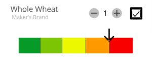
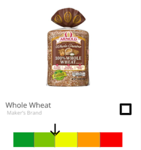
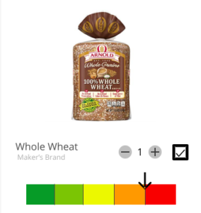
Individual Item Bar Graph
There were multiple points of confusion in this interaction. First of the two primary issues was that for the users mental model, the color coded nature of the bar conveyed diverse meanings which were not related to the price of the item as we intended it to be. Our data shows us that this scale does not directly translate to the attributes that are associated with the price of a product.
 |
 |
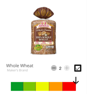 |
The arrow in our design scaled proportionally to show a relation between the price of a particular item and the budget that was remaining. People think of prices as absolute parameters and the price is rightly so. Unless it is explicitly clear what the moving arrow means, it is difficult for users to understand. Relational price is something that never comes to their mind mainly as price is something that is supposed to be fixed and not a lot of systems use relational values when dealing with prices. As our participants eagerly adopted this system once they understood what it meant, it indicates that as this is unfamiliar territory, users will need some sort of training before they can be used to it.
Potential Prototype Improvements
Overall Budget Graph Design
As participants added products, the “overall budget used” graph increased along with each category budget’s graph. We may amend the design to add additional copy “add products to meet your overall budget”, informing the user of a more clear action to adjust the graph’s values.
We also amended the overall budget graph so it would remain “sticky” or omnipresent on the top of the screen. When the user scrolls down to add products and view all of their food categories they are now able to see how their actions affect the overall budget.
Category Budget Graph Design
The category budget selection process was something we did not explicitly define for the participant in our prototype. We believe this attributed to confusion when selecting their category budget. In our amended design, we may include the numerical value selected by the user for the category budget adjacent to the category graph.
Product Pricing & Product Selection
We may include the product’s price very subtly - with decreased font size and opacity - and placed underneath the product’s name. We are thinking about including it for reference only. Although we saw participants in our control group exhibiting more frustration than participants with the app, we would like to amend the design in-app to mitigate the participants’ frustration during their product selection.
Disabled Products Over Budget
We have realized disabling a product, or prohibiting a user from selecting the product in their shopping list due to any reason, could be considered revoking control from the user. In our amended design, we depart from “prohibitory” functionality, and instead, warn the user and still allowing the user to select it anyway. The product that is over budget will have a warning icon on the product graph, along with text warning “OVER BREAD”.